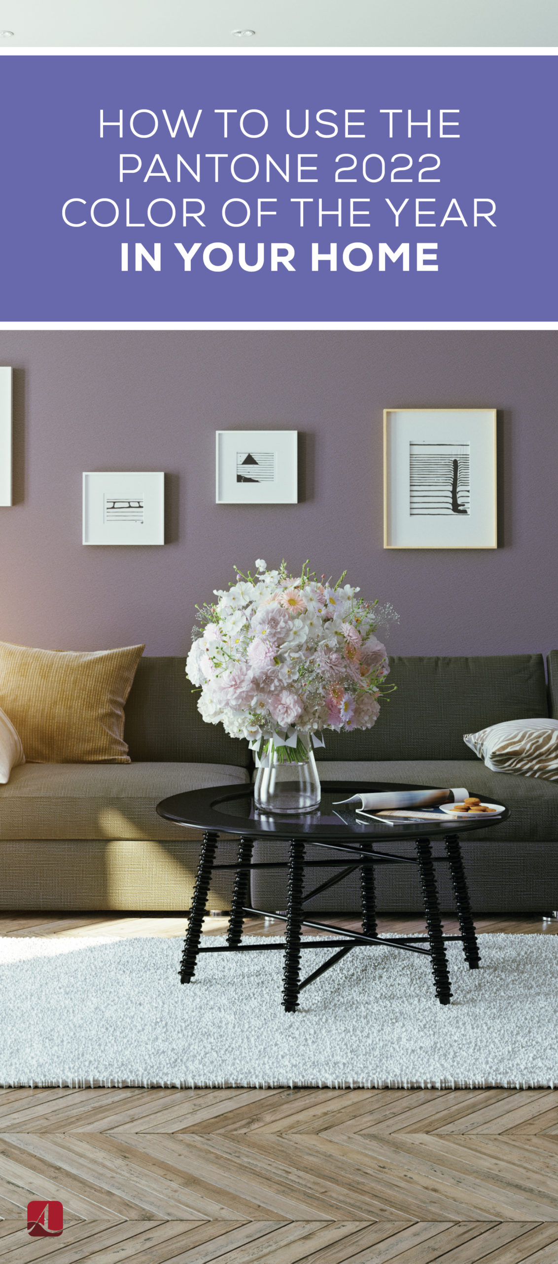
How to Use the Pantone 2022 Color of the Year in Your Home
“A new Pantone color whose courageous presence encourages personal inventiveness and creativity.” -Pantone
Pantone has been introducing a new Color of the Year for more than twenty years, influencing home design across the globe. For the first time, Pantone made a brand new hue for 2022 rather than selecting it from the company’s existing array of over 2,000 hues—and people are loving it already. Here’s a guide to all you should know about the hue “Very Peri” and where you can use it to energize your home in the year ahead.
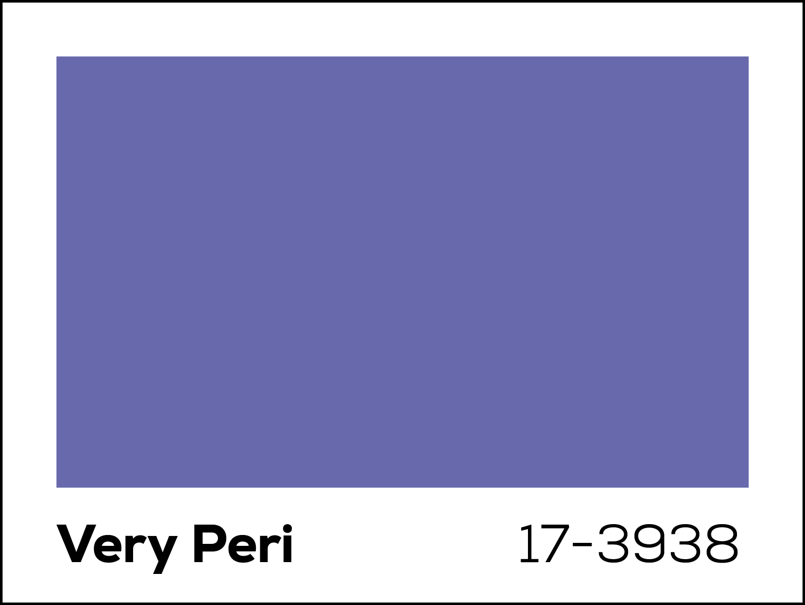
Shade 17-3938: Very Peri
Very Peri is a dynamic shade that combines the calmness of Pantone’s beloved blue tones and the undertones of a passionate violet-red. According to the company, the color reflects the transformative times the world is living in, so the color-picking process had to be new too.
The process for choosing The Color of the Year is a thorough undertaking by Pantone’s Color Institute experts, who search around the world drawing inspiration from entertainment, art, sports, fashion, architecture, technology, and relevant global events.
The 2021 Color of The Year was two hues “Illuminating” and “Ultimate Grey.” They are both warm shades that invoke positivity, which many people desired during a difficult time navigating COVID-19. As the world comes to terms with a new normal, 2022’s periwinkle hue inspires creativity and excitement for new possibilities.
Pantone says that it wanted a “futuristic color that reflected global innovation taking place at the moment.” The theme of Very Peri is to look forward and continue to create despite the hardships many people have faced recently—and to have fun doing it. The world’s seriousness has detracted from the ability to embrace playfulness, so using this color can encourage you to return to your best self.
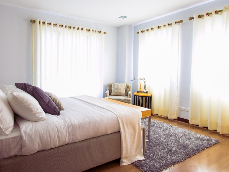
The best places to Use Very Peri in your home
Considering the playful and innovative tone of Very Peri, you should use this hue experimentally and joyfully. Don’t be afraid to use this color in places you typically wouldn’t. Generally, it’s recommended that you pair periwinkle shades with neutral colors like taupe and cream.
Office accents
Inspire your creative side while you work from home by including accents, such as a pencil holder, mouse pad, or plant pot, in a Very-Peri-like hue. If you want a more noticeable pop of color, add an accent rug under your desk or paint your bookshelves. If you’ve been looking for a color boost to bring you energy throughout your workday, this could be the color for you.
Kitchen decor
If you’re like most people, you’ve been using your kitchen more since the pandemic started. Get creative with your recipes and bring more enthusiasm to your cooking atmosphere with a Very Peri backsplash. If you’re looking for a less permanent addition, purchase new kitchen towels, a table runner, and placemats to bring a colorful discussion to the dinner table.
Game room walls
Some people have noted that Very Peri is similar to the original Game Cube color! With childhood nostalgia in mind, this is a great accent wall color for a game or entertainment room. If painting your walls isn’t a priority, add a pop of color with a throw blanket and pillows on your game room couch.
Where to find Very Peri-colored items
On the Pantone website, you can shop mugs, notebooks, swatches, and other design tools in the exact hue. While Pantone doesn’t sell wall paint, the closest wall paint color available is Dunn Edwards’ Bellflower. Consider bringing a picture or printed swatch of Very Peri to your home improvement store to match with what they have available. If you’re looking for home decor items in this shade, or something close to it, here’s a list of a few to consider.
– Area rug
If you need something to look forward to in 2022, one look at the shade Very Peri can excite you for redecorating in the year ahead.


