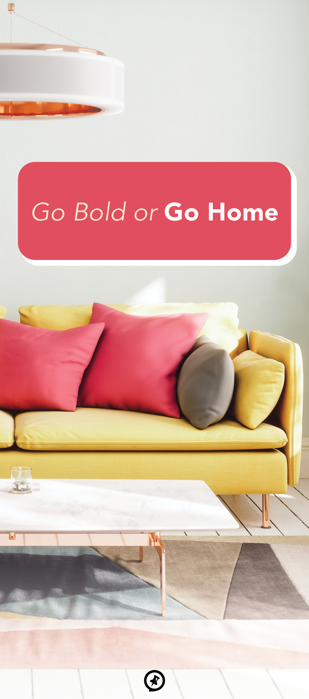
Embracing Bold Colors and Patterns
Many people want their homes to make a statement. Whether it’s a clean, easy design or a finely curated collection of furniture, there are a variety of ways to make your home pop.
But nothing quite compares to the use of bold colors and patterns in home design. If you’re looking to revamp your home, dare to be striking with these surefire ways to add visual interest to your spaces.
Maximalism Vs. Minimalism
When you think of bold design choices, you likely picture rooms with more stuff, be it more furniture, more colors, more pillows, or more pictures. And while it’s true that many bold interior designs do take a maximalist approach, colors and patterns can also be minimalistic. It’s all about your personal design preferences.
A minimalistic approach to colors and patterns requires being strategic not only with what you choose to put in a space but also with what you choose to leave out. For instance, you can start with a muted palette of natural colors and then add a patterned or vibrantly colored rug, pillow, or paint shade. Maximalism also requires strategy: one that’s focused on preventing spaces from feeling overwhelming or messy. Rather than just filling a room with things, this design approach is about creating textures in a room using different styles, colors, and patterns. Make the focal point a daring wallpaper that you tie into the rest of the room by incorporating similar shapes and colors, creating a sense of cohesion among the busyness.
Know your complementary colors
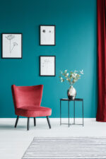
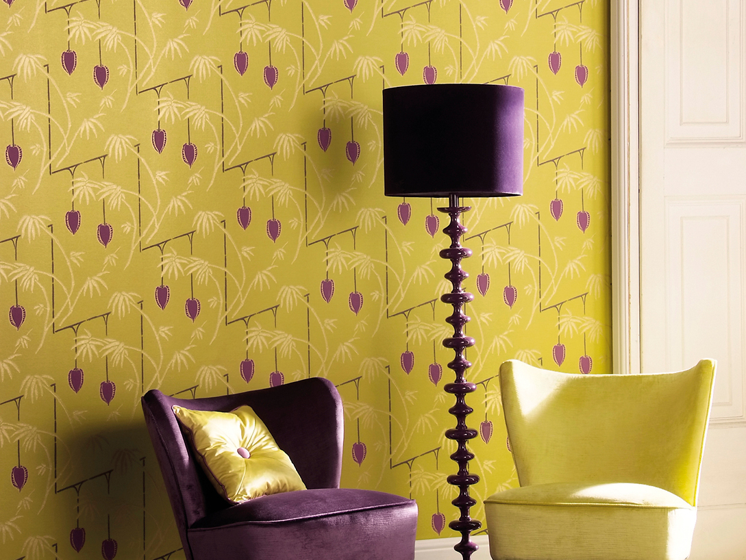
While a boldly designed room might look randomly styled, a lot of thought typically goes into which colors work not only within a space but also with each other. If you’re looking to bring some pizzazz into your home, you should familiarize yourself with color theory, specifically the one of complementary colors. These are colors on opposite sides of the color wheel—such as yellow and purple, blue and orange, and red and green—that make each other appear more vibrant. Using color theory as a guide for your design is a great way to ensure that the colors will visually work well together in your space.
Be strategic with mixing patterns and colors
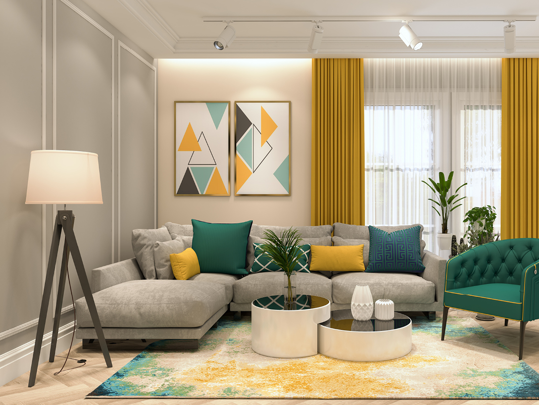
Of course, your colors shouldn’t just be complementary to each other. You also need to make sure the patterns you use work well with your selected colors and create a sense of cohesiveness in your room. For example, floral patterns work well with greens and yellows whereas geometric patterns can complement a black-and-white scheme. If you find a patterned piece of decor that you love, whether it’s a wallpaper pattern, rug, couch, or painting, you can choose one color from it to then carry throughout the room. Doing so will tie the two together and make your space livelier and more visually interesting.
Decide where to make the loudest statement
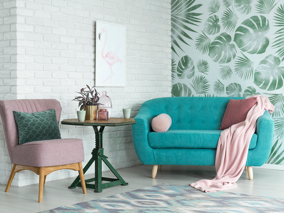
Even when using bold colors and patterns, be strategic about where you’re using them in your rooms. You don’t necessarily want to cover every surface in a pattern; instead, pick one area to feature the loudest wall or piece of furniture. This will help prevent the design from feeling overwhelming. In an office, you could wallpaper one wall as the focal point to play off of with the rest of the decor. The single-patterned wall would then have a bigger impact than if you chose to cover every wall in the wallpaper.
Make sure the space is anchored
Have you ever entered a room and felt like something was off? Perhaps your eyes couldn’t settle on one area, instead repeatedly looking around the room. One reason for this could be that the room wasn’t visually anchored and featured a design that was unbalanced or felt out of place in the space. Rugs are a common way of anchoring living rooms since they can bring the couch, coffee table, and decor all together; you can also opt for a specific piece of furniture or color. It’s this anchored element that will unite all the different elements in your space and create a sense of rightness.

