How Design Experts Avoid Common Pitfalls
Photo courtesy as noted
If you’ve ever carefully planned and styled a room but felt underwhelmed by the final result, then you know how difficult pulling together a design can be.
Oftentimes, the problem is a small yet impactful error—the key is determining what, exactly, that is. Here are just a few of the most common ones to look out for along with some proven techniques, straight from top professionals, to try instead.
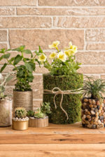
Avoidable wall fails
When decorating a space, you may think your first step should be to focus on the bones of a room, but that can be a mistake. “Many people choose a favorite color and start painting before finalizing their furnishings and accessories,” says Taniya Nayak of HGTV’s Battle on the Beach. “Although it might seem counterintuitive, it’s much easier to find the perfect paint color after everything else is in place.” She notes that by deciding on core elements like your furniture, curtains, and rugs before your wall color, you’ll have the opportunity to take your fabric and other swatches to the store so you can find the hue that best complements your overall design. And if your room doesn’t look perfect after everything is put together, you can easily repaint it.
Another tip from Daniela Gottschalk, owner of the interior design firm Tinzeltown: “If you’d like to create an accent wall, don’t bore everyone by selecting a modest paint color or wallpaper. The latter works well as an accent—but only if you make it loud.”

Cookie-cutter flubs
As showcased on her blog Cuckoo 4 Design, skilled DIYer Julia Konya has a home that looks like it’s straight out of a high-end magazine. Her secret lies in her attention to detail, ensuring that every piece she chooses enhances a room’s aesthetic and harmonizes with the surrounding elements. “My biggest pet peeve is being too matchy-matchy with accessories or, even worse, buying full furniture sets,” she says. “Instead, collect a mixture of styles, design periods, fabrics, patterns, and finishes you love to create interest and make it look like your space was carefully curated over time.”

Artwork faux pas
While adding wall decor like paintings can make a space look more coordinated, it requires a careful touch. In fact, hanging such items too high is a top blunder, according to Lyndsay Lamb, cohost of HGTV’s Unsellable Houses and co-owner of Lamb & Co. She explains, “This is especially noticeable when there’s furniture below artwork, such as a sideboard or console table. You want to avoid leaving an awkward, oversized gap between the two.” It’s not difficult to find the best placement, though. Lamb notes that the best rule of thumb is to hang decor so its middle is directly at your eye level.
Paulina Perrault, a California-based expert in practical luxury, says that the way you frame your art can also be problematic. “Always go bigger than your first instinct might tell you regarding the scale of the matting and the frame,” she suggests. “An impactful frame and a wide mat can make a piece feel more consequential in the space and draw more attention to it.”

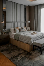
Sizing snafus
Using correct scale and proportion is crucial for creating a harmonious look. When elements are too large or too small for their surroundings, they can make a room feel imbalanced. “As designers, we start on scale in some of the first classes in our training,” says full-service Dallas designer Janice Burkhart. “Countless hours are spent sketching interiors and getting the spacing right.”
For instance, a rug can do more than simply add ambience—it can define an area, anchor furniture, and add visual interest by introducing color, texture, or pattern. Leslie Lamb, twin sister to Lyndsay as well as her cohost and co-owner, advises that when getting one for your space, make sure it complements your room’s dimensions without being overly small. “A good guideline is that the front feet of your couch should fit comfortably on the rug to create a more cohesive look,” she explains.
It’s especially important to consider scale when furnishing a bedroom. “I’ve arrived at numerous client consultations only to find a king-sized bed paired with tiny nightstands—almost like something out of Alice in Wonderland,” shares Perrault. “Such stark contrast in size is not only visually jarring but can also hinder the functionality of the space, preventing you from fully optimizing the room’s usefulness.”

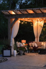
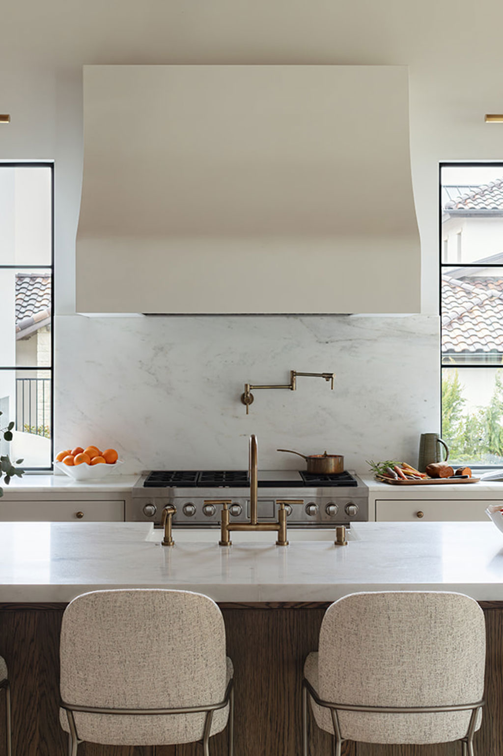
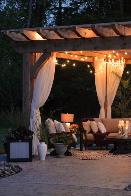
Lighting lapses
Many people overlook the value of incorporating additional light sources beyond the traditional lamp or chandelier. Says Bilal Rehman, a designer and content creator who excels at the unconventional, “Scrimping on lighting is one of the biggest mistakes homeowners make, yet it’s one of the simplest and most affordable ways to elevate a space. With an optimal temperature (my go-to is 2700K for a warm, welcoming glow), layering lights adds depth and dimension instantly. I use this trick both in my personal space and in every project I complete for my clients. The difference is drastic and so easy to achieve!”
A good example of how to apply this tactic is in the kitchen. Instead of relying on just a few recessed ceiling lights, also affix rope lights to the bottoms of your upper cabinets and install pendant lights over your island. You’ll be rewarded with a well-lit and inviting space that is both functional and aesthetically pleasing.

Now that you know what mistakes to avoid, you’re ready to get to designing! With these suggestions and a little creativity, you can transform your home into something that’s truly special and beautifully yours.
2958 Views
Related Posts


Popular Posts