An Open and Airy Abode
Interview with Kristen Fiore
Photo courtesy of Kat Alves, unless noted
Interior designer Kristen Fiore explains how she made a confined, old-fashioned California home feel bright and spacious enough for its very social residents.
Tell us about your design background:
When my kids were old enough to start going to school, I went back to school as well. I got my design degree in 2015, then opened Kristen Elizabeth Design that same year. My team and I have been growing and honing our craft ever since. Despite so many economic challenges, we still have a completely full client book.
What was the clients’ vision?
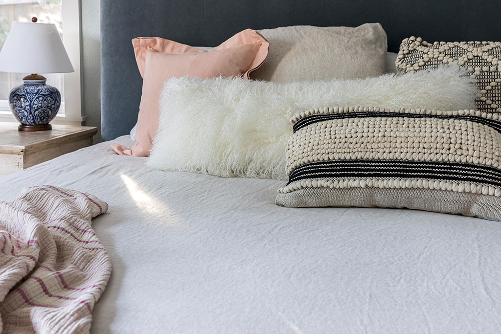
It’s funny—they weren’t entirely sure what they wanted. I vaguely knew the clients, a married couple, from various social circles within my town, and they reached out to me. They knew they needed a more functional space because they have three kids and a big dog, but they had a really hard time conceptualizing what to do. The clients were very open to taking risks with me and my team, which was nice.
Did they express any reservations or limitations?
They trusted us immensely, especially as they saw our work taking shape. While they initially hired us to improve the living spaces, we ultimately redesigned everything except for the kids’ bedrooms—they were teenagers, and one was leaving for college soon.
How did you get to know the clients’ tastes?
We have an extensive onboarding process. First, we interview the clients for a couple of hours to get to know them and their families. Then we go through an “inspiration and aesthetics” review to find out what they gravitate toward.
The husband’s tastes leaned more traditional than his wife’s, so he had several questions like “Is this going to be too modern?” and “Is this ‘us’?” We had to find a way to balance both of their preferences. What helped is that our team has a very collaborative approach at all times. Ultimately, they both absolutely loved the results.
What were your impressions of the house when you first saw it?
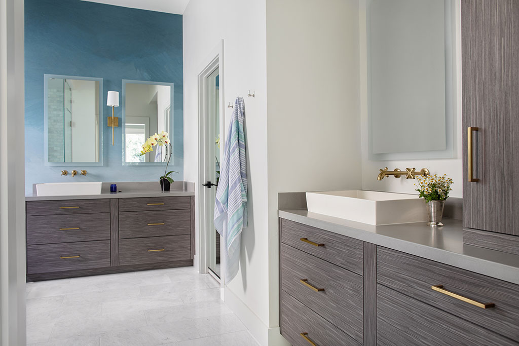
It was a completely traditional, dated, 1990s California tract home—the rooms were all isolated, and there was little character or flow to the space. The family is very social and frequently spends time in the common rooms together. They also entertain a lot. But everybody had to congregate in two rooms, which felt too small. While they had a beautiful living room, it just didn’t work for the family’s needs.
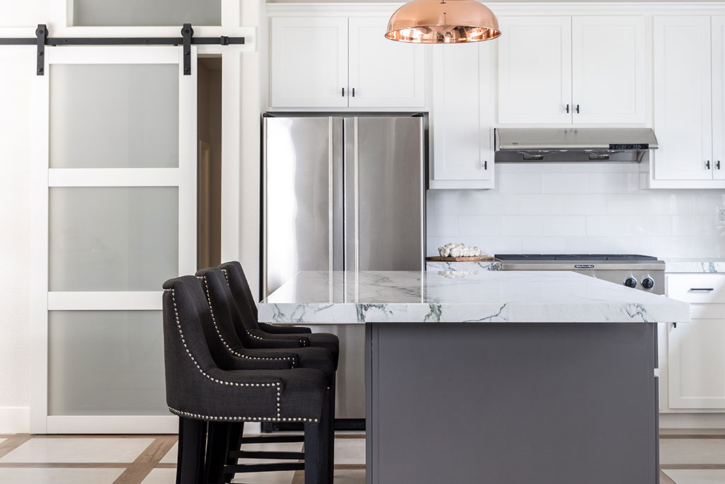
The kitchen was also terribly dysfunctional; there was cabinetry surrounding the perimeter, and it felt so enclosed. So we opened up the living areas into an L shape. The kitchen became the corner of the L with the family/music room in the front and the living room in the back. We then added huge custom pocket doors to separate the family room from the kitchen. That way, the clients could leave them open to create fluidity between all three spaces or close them off so they could host a party in the kitchen while people watched TV in the family room.
What would you say was your favorite transformation?
I loved opening up the kitchen to the living room and creating a double-island layout. The interior island acts as a dedicated workspace, and the peninsula island that divides the living and dining area from the kitchen creates a space for entertaining. When you walk in, it feels like that’s how the architecture should have been from the beginning.
We made a lot of functionally driven choices with the aesthetic in mind. For instance, even though the house didn’t have a proper dining room, we added a custom dining table next to the kitchen that fits perfectly in the space and makes it purposeful. Now every little space within the common area is useful daily.
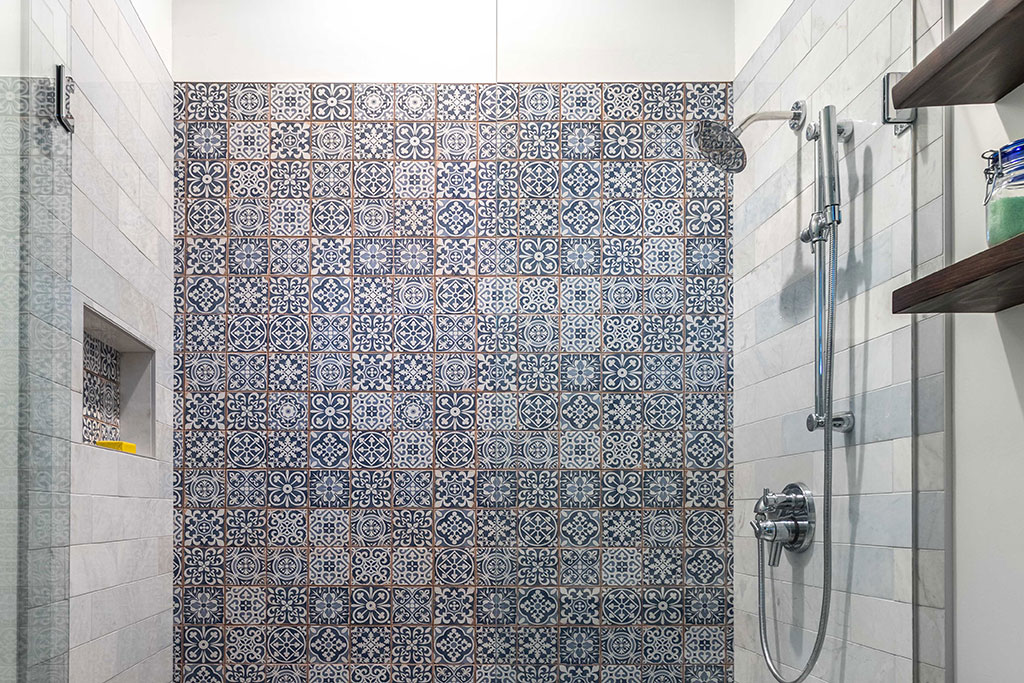
I also love what we did in the kids’ bathroom. We removed the bathtub and installed a shower, which is more convenient for teenagers. For a standout feature, we added floor-to-ceiling patterned tiles.
Why did you decide on a primarily white aesthetic for the house?
We wanted to lighten it up. The entire house was adobe brown, dark, and dreary, and the windows had such heavy draperies on them. We stripped it all down to a blank canvas. When you walk in now, it feels so fresh and happy.
What design challenges did you face?
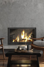
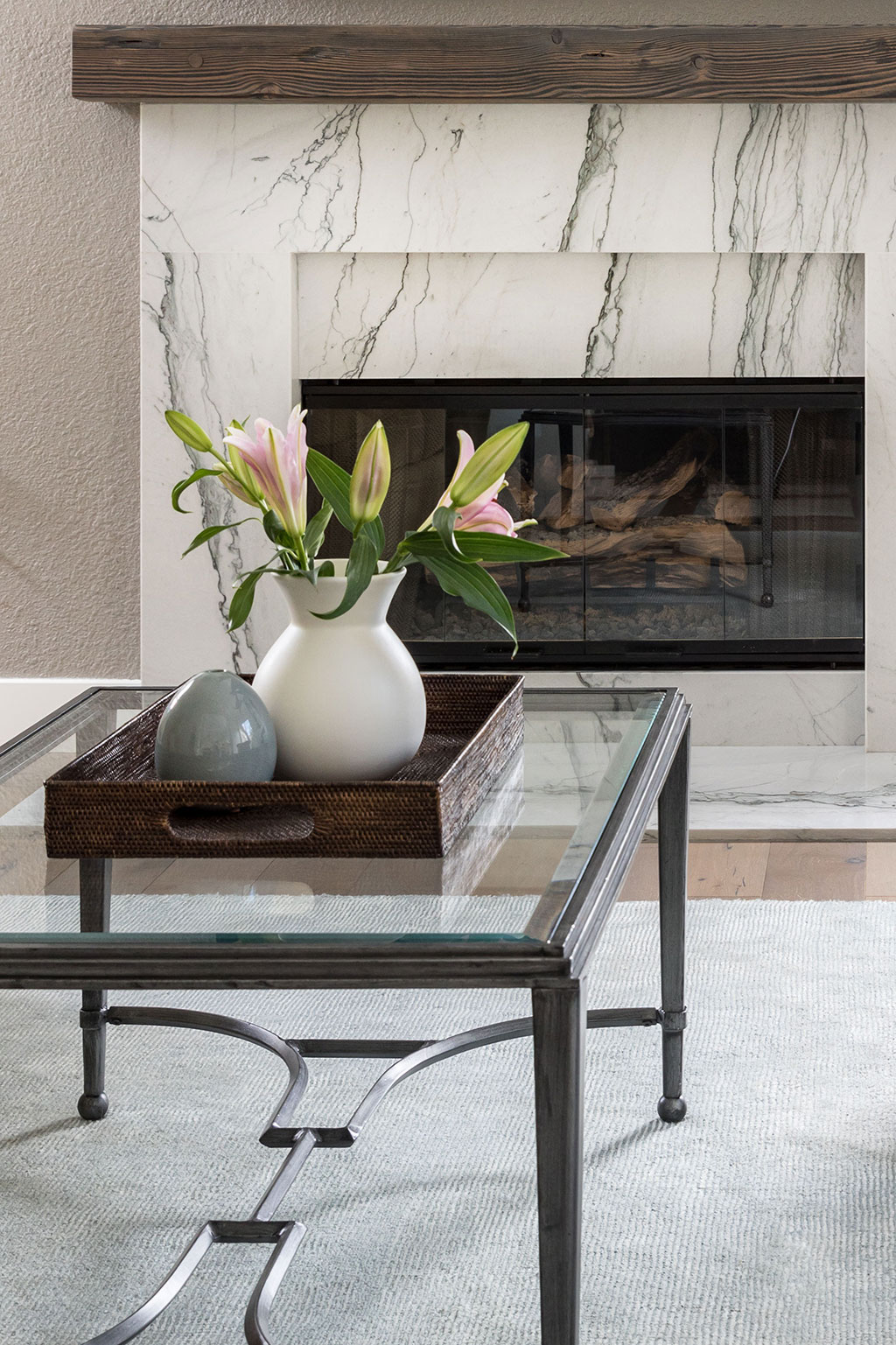
We were definitely mindful of all our choices because there was an investment level that the clients didn’t want to push through. For example, the Black Label sofas in the living spaces are stylish yet timeless, but they’re also surprisingly affordable. At the same time, we were smart about choosing some authentic, classic materials. One of our biggest investments was the quartzite for the countertops and fireplace. We felt strongly about installing genuine stone versus man-made quartz or porcelain because of how timeless it feels and performs. This longevity added value, so we didn’t scrimp on the material. We then determined where we could get away with saving, such as by using premade ceramic tile that looks handmade but costs less.
What are some lessons other homeowners can learn from this project?
Mainly, be open to stretching your design ideas or tastes. Trust the expertise of a professional, even if you may be a little uncomfortable in the beginning. With this project, the clients pushed themselves to go a few extra steps with us, and it paid off.
I would also say to put your money where it’s going to count the most in the long term. Classic materials are always timeless. Unlike a trendier material you might find yourself having to tear out in a few years, they never go out of style.
For more info, visit kristenelizabethdesign.com


