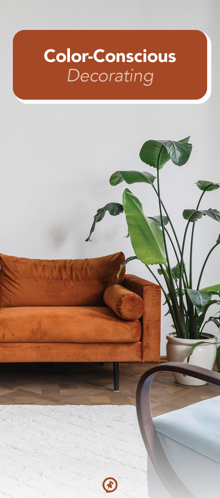
Color-Conscious Decorating
It’s downright visually arresting when colors sing together.
After all, is there anything better than a forest-green pillow propped up on a sienna armchair? Believe it or not, there’s a complex science behind color concord, even if it’s something that seems purely subjective. In other words, our eyes can detect when a room has a pleasing palette, even if we’re unsure why it just works.
If you approach home design with deliberate color schemes in mind, you can craft seriously stunning spaces. Use the following advice to identify cohesive hues and choose features like sofas, rugs, pillows, and art in perfectly balanced shades.
The color wheel
This detailed tool may seem intimidating at first, but once you familiarize yourself with it, you can find shortcuts to designing any room. The color wheel shows the relationship between colors, starting with the three primary ones (red, yellow, and blue) and the secondary shades you get from combining these (orange, green, and purple). More complex tones arise as you proceed outward to the wheel’s edge. Here are the types of appealing schemes you can create by using it:
- Complementary: opposite-facing colors on the wheel that balance each other out, such as blue and orange
- Monochromatic: a tone-on-tone scheme that combines various shades of the same color, such as forest green, olive green, and aloe green
- Analogous: a symphony of like colors with similar base tones— such as emerald and gold, which have primary yellow in common
- Triadic: a triangle of three evenly spaced colors on the wheel, such as yellow-orange, turquoise, and fuchsia, for bold yet balanced contrast
- Tetradic: a four-color scheme that includes two sets of complementary hues
It’s possible to dive even deeper into color theory, but doing so can really consume an afternoon. So it may be more efficient to use a digital color wheel, such as the one by Canva, to build nice palettes for your home rather than attempt to construct them on your own. Don’t overthink this; just try out various schemes and placements on the wheel until you arrive at ones that stand out to you.
Neat and Neutral
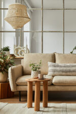
Want a shortcut to style without having to spin a wheel? Embrace the trend of all-neutral rooms, which feature colors like white, gray, brown, and black. Going neutral is a very trendy approach to design, and rooms with these shades are fairly simple to arrange. But because such styles are devoid of bolder colors, they need a balance of dark, light, and medium tones to lend visual appeal. For example, decorate a tan dining table with medium-gray chairs, then top it with black candleholders and white candlesticks. It’s that easy—these pieces will look magnificent together and create a perfectly pleasing atmosphere.
You may find the pure-neutral look too sterile and prefer more energetic or soothing pops of color. If so, go for it! Just keep in mind that every room needs neutrals; they balance bolder tones, keep them grounded, and prevent rooms from looking oversaturated. And, fortunately, you’re free to blend neutrals as you’d like without fear of clashing. They don’t exist on the color wheel because they’re not based on combinations of red, yellow, and/or blue, so they won’t compete with other hues.
Find Inspiration
Now that you know how to build a color palette, you can play with various schemes and implement them right at home. Of course, that leads to the next challenge. Inspiration is often difficult for creative projects like home design, especially when you’re dealing with an empty sandbox of a room and aren’t sure where to start. How do you build a color scheme when you don’t have a dominant hue in mind?
Perhaps the simplest way to begin a design or redesign is to base it on the space’s current palette. Select your favorite material or decorative piece in a room, and work from there. Maybe you have a gorgeous tufted sofa in maroon and a tropical painting that features vibrant sea blues. Take the dominant colors of these pieces, and use the color wheel to find suitable hues that pair with them. Continuing the previous example, ivy green would form a triadic scheme with maroon and sea blue, so you could add leafy plants and matching accent decor to the room. Pepper in some light neutrals like beige pillows and dark neutrals like walnut end tables, and you have a balanced, harmonious space—again, it’s that easy.
Plotting your course
Once you know where to start, you can shop for home goods that fit neatly into your preferred color scheme. Be sure to print out or take a screenshot of the palette you designed (or carry swatches) to use as a guide as you hunt down accurate hues. To stay on track with your new scheme, try shopping for furniture and decor in this priority order.
Large pieces
Opt for broad seating furniture and prominent storage pieces in neutral shades. (Remember to balance light tones with dark ones.) Alternatively, you could add one eye-popping element in a bold color like goldenrod or amethyst to give a room an excellent centerpiece.
Smaller decor
Think wall art, armchairs, plants, and side tables. These pieces are better for introducing bold colors, but try not to oversaturate rooms. If you ever feel like you’re going overboard, select neutrals to pare back—after all, they will match virtually everything!
Accent decor
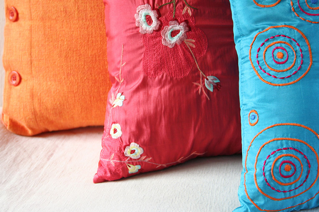
These are the simplest pieces to swap if you’re tweaking the palette of a finished room. Find pillows, throws, vases, coffee-table books, and other ornaments that directly showcase your color scheme for pops of attention-grabbing vibrancy. IKEA’s and Fable’s online shops, for instance, offer tools that allow you to browse by color and pinpoint perfect matches.
Love the room you’re in
If you’re still feeling overwhelmed by the rainbow of shades on the color wheel and the multicolored patchwork of goods in home decor shops, you can hand the task of decorating to a professional. But whether you decide to go it alone or enlist help, there’s a special, undeniable joy in identifying a beautiful piece of decor and just knowing that it will match perfectly with its surroundings. Slide a vase onto a shelf, step back, and admire it nestled among its new family.

