Colors in Harmony
If you’ve ever had trouble choosing a paint color for your home or wondered how designers and artists always find the best color combinations, you’re not alone. Their secret is the application of color theory to every detail. Color theory is a useful tool you can use when choosing colors for your paint, furniture, and finishes—and it’s easier to implement than you might think.
The idea of color theory
Color theory is both a science and an art that involves the study of hues and how to use them in harmony. In art, color can affect the mood and aesthetics of a piece, but the same principles apply in home design.
The color wheel
The characteristics of every color are determined primarily by its hue. The first color wheel dates to the seventeenth century, when Sir Isaac Newton observed the visible spectrum of light during his prism experiment. He saw that all color combinations came from three primary colors. From those three, he discovered secondary and tertiary color combinations.
- Primary colors: red, yellow, and blue
- Secondary colors: primary colors mixed in various combinations that result in green, orange, and purple
- Tertiary colors: colors made from one primary and one secondary color, such as blue-green
Shade, tint, and tone
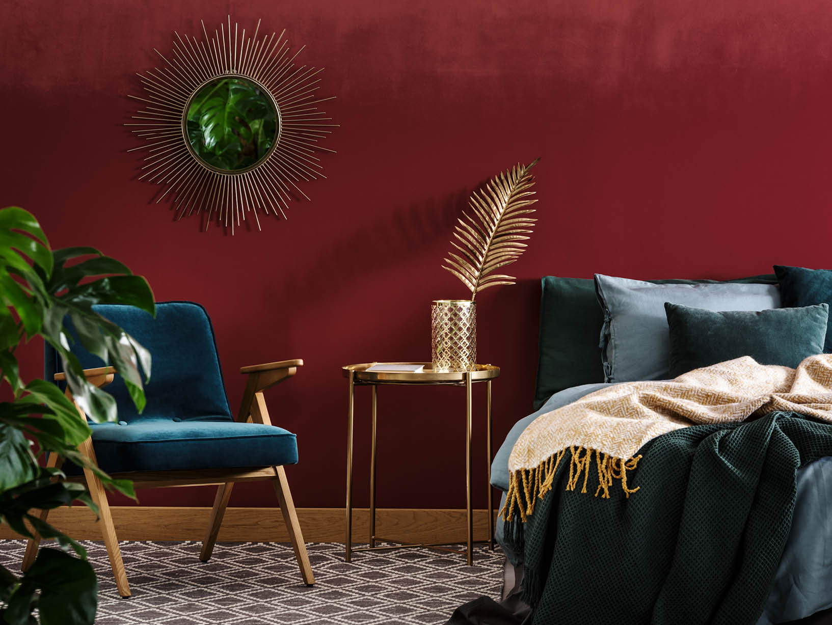
American painter Albert H. Munsell expanded Newton’s ideas into a three-dimensional color tree by adding the categories of chroma (the purity or intensity of a color) and color value (the lightness or darkness of a color). The interactions of hue, value, and chroma are the basis by which we still interpret color today as shade, tint, and tone, which can change a color’s intensity and its appearance when next to other colors. That’s why you might think a bright red and bright green look like the holidays but a burgundy and forest green look regal.
- Shade: a color to which black has been added
- Tint: a color to which white has been added
- Tone: a color to which black and white (or gray) have been added
How to apply color theory in design
Now that you understand how colors interact, you can use the relationships of all colors to find a beautiful palette you can use in your home.
Step 1: Pick a color temperature
Choosing a color temperature for your room is the first step to using color theory in design. Color temperatures range from cool to warm, and, just like a thermometer, you can gauge with your eyes how cold or warm a color is. Depending on a color’s temperature, it can invoke feelings of joy and passion or relaxation and creativity. Traditionally, the three coolest colors are blue, green, and purple, but they can become warm if they’re mixed with a warm shade. The same can be applied for warm colors when mixed with cool shades. Even neutral colors have a temperature; you just need to determine their undertone.
For example, a cool blue bathroom could feel like serene spa while a warm yellow bathroom could feel like a burst of energy in the morning. Think about what time of day you like to shower and when you spend the most time in your bathroom. Use color temperature according to your preferences and how you want to feel when you step into the room. You can mix warm and cool colors or stick to just one color temperature depending on the look you’re going for. A mixed color temperature palette can offer a more playful and bolder atmosphere than a single color temperature can.
Step 2: Choose a color scheme
It’s time to decide which colors you want to use. Be mindful that the more colors you use, the more carefully you’ll need to place them. The following combinations are known as harmonies, and each will bring a unique look to your space:
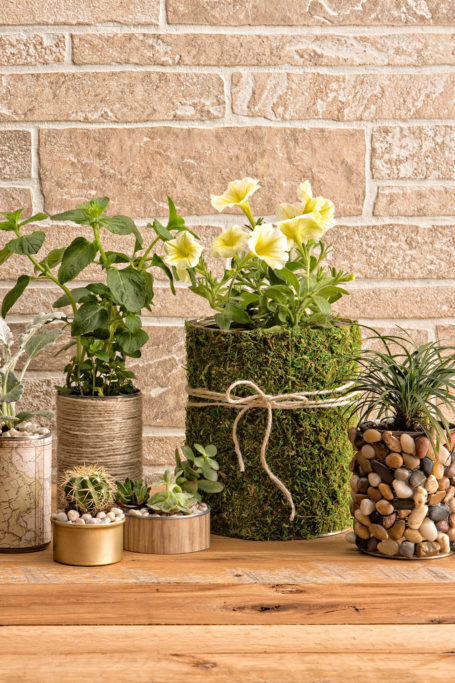
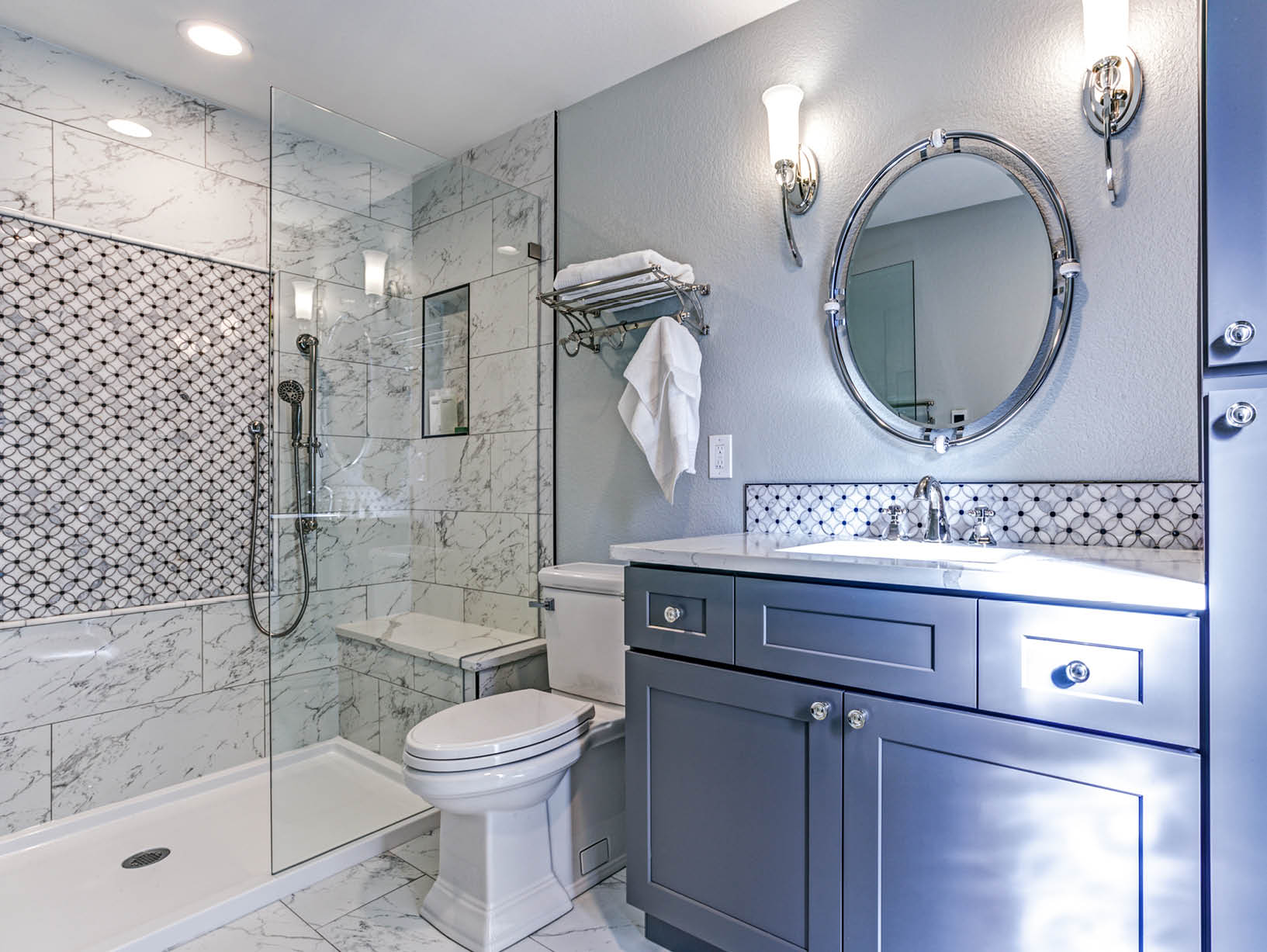
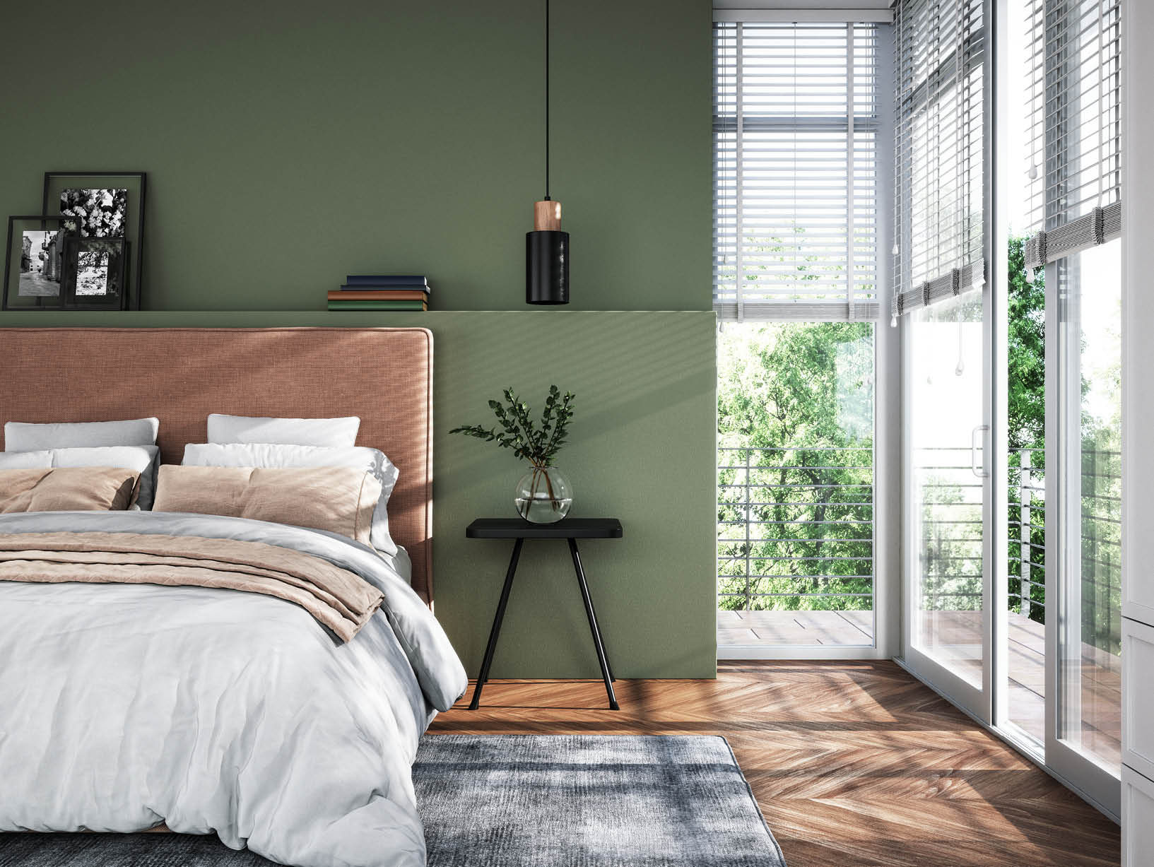
- Monochrome: Three shades, tones, and tints of the same color for a subtle and relaxing aesthetic. The best spaces to use a monochrome color scheme are a bathroom or bedroom.
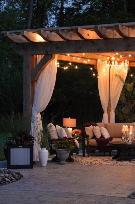
- Complementary: Two colors that are on opposite sides of the color wheel. This combination will emphasize the colors you choose for a bold look. A formal dining room or entryway looks great with complementary colors.
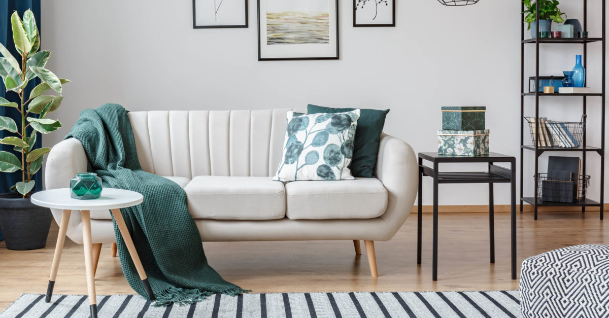
- Analogous: Three colors that are side by side on the color wheel that offer an understated look. Consider an analogous color scheme for an office or other another area that needs a hint of color without looking busy.
- Triadic: Three evenly spaced colors on the color wheel that create a vibrant look using one dominant color and two accent colors. Try a triadic palette in a room with no windows, such as a finished basement.
- Tetradic (double complementary): Four colors evenly spaced on the color wheel. Typically, there is one dominant color and three accent colors. Use a tetradic scheme in a child’s bedroom or creative hobby space.
Step 3: Balance your palette
How can you determine how much of each color to use? It can be easy to find a color you love and run with it, but make sure that you attractively balance your palette. Most designers abide by the 60/30/10 rule; a dominant color covers about 60 percent of the room, a secondary hue takes up about 30 percent of the room, and accent colors top off the room at 10 percent. This rule doesn’t just apply to paint—it can be used for every element in the room. Pillows, furniture, lampshades, window treatments, and rugs should be a part of the color equation. The 60/30/10 rule is just a guideline, though, so don’t be afraid to find your perfect balance.
Be sure to think about how your lighting will interact with the colors in the space too. As previously mentioned, white and black affect the shade and tint of colors. If you have less natural light hitting the room, you can add pops of white. If your room is full of sunshine, consider adding dark accents.
When in doubt, an interior designer can be a great source of expert information and inspiration. When applied properly, color theory can transform your home into a space you love.