A Midcentury Modern Tree House Home
Gianpiero Gaglione of GG Interior Design shares how he redesigned Rosilla Place, a midcentury modern home in Laurel Canyon, California.
Gaglione took care to stay true to his clients’ love of antique, inherited objects while also ensuring that the results felt modern, fresh, and ready for entertaining.
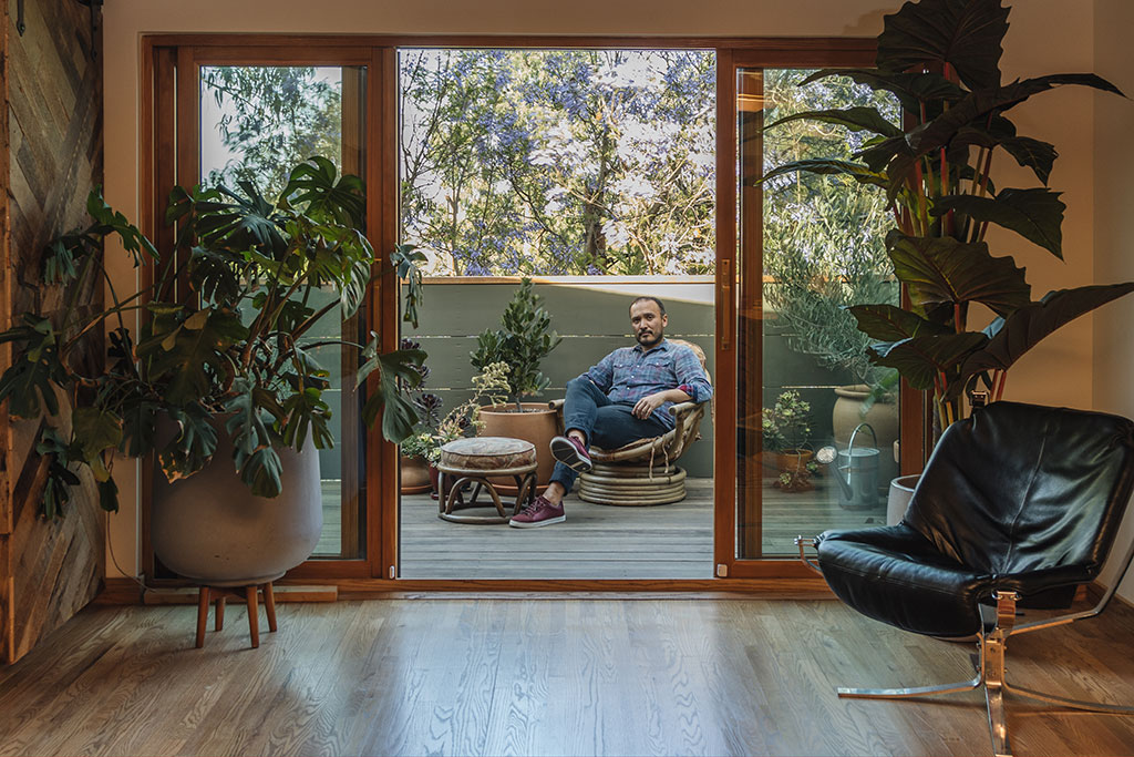
What is your background in design?
I’ve been designing for about twenty years. I initially worked for a lighting company and then a furniture company back in the UK designing different ranges of products for clients, which taught me to apply myself stylistically to a variety of tastes. I’ve also worked as a designer in New York, Mumbai, and Singapore.
Most of my projects have been for hospitality clients, but once I moved to Los Angeles, I started freelancing for friends who work in interior design. Now almost all my work is residential. One of my oldest, closest friends got me involved in the Rosilla project. They introduced me to the homeowners, Nicholas and Caroline, a film producer and podcasting agent, respectively, who wanted to redesign their first home together. They’d recently purchased a 1950s post-and-beam that a previous owner had remodeled. It was very out of step with what they—and the house itself—wanted to be.
What were their overall design preferences?
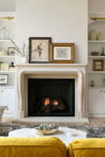
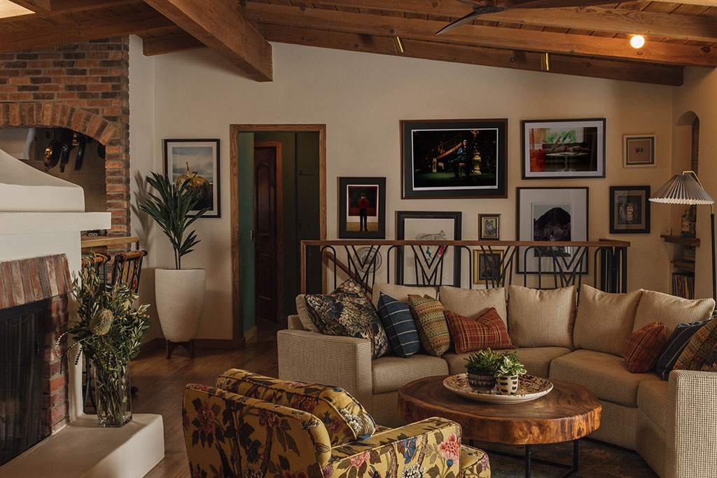
They wanted their house to feel more personal—more like a home. It already had really good bones: the ceiling was timber, and the central fireplace was stunning. But there were a lot of different items from different places, so it was missing a sense of cohesion to pull everything together.
How did you get to know the clients’ tastes?
I like to spend a couple of hours with someone and just chat with them. Where do they like to go? What do they like to do? Through these conversations, I learned that the homeowners love hosting and appreciate antiques.
Another good way to get to know a client’s design tastes is to look inside their wardrobe and learn about colors or patterns they like, what they’re comfortable with, and what they enjoy. I could see in my clients’ clothing, and their art, that they had a really eclectic, bohemian sensibility.
How did you approach this project’s design?
Left to their own devices, the couple would have imbued mostly traditional and inherited items. It’s easy to put antiques in an older home, but this midcentury one was less suited to that. A complex scheme helps make a home feel lived-in and comfortable. If everything is from the same store or era, a space can feel untouchable, almost like it doesn’t really belong to anyone. So it’s important to blend different styles, though balance is necessary.
I didn’t necessarily want to just dump everything and start over, however. I thought, How do I make sense of all these different items and pull together a story? That was where I started.
What did you do to achieve a cohesive style?
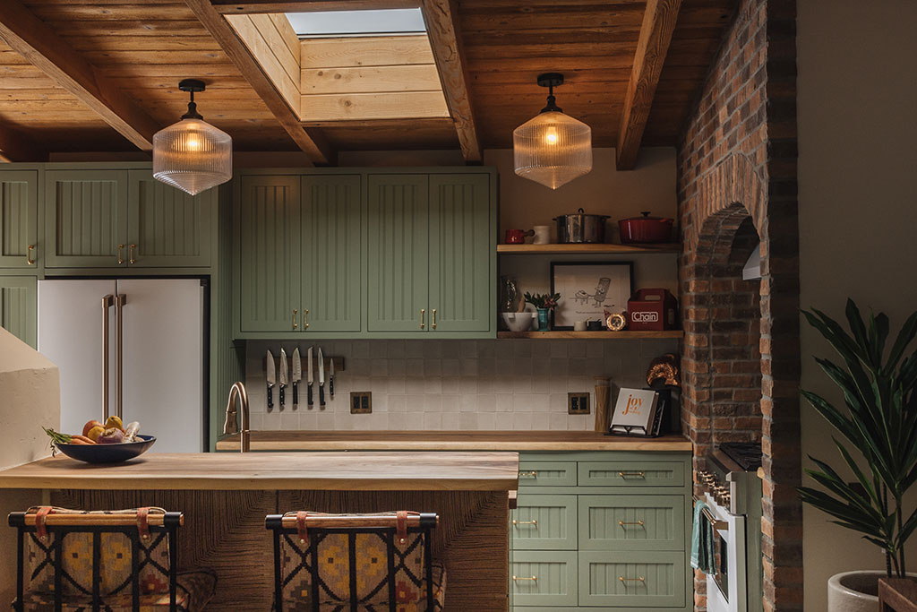
There were plasticky and metal materials that just didn’t make sense or weren’t welcoming—a chrome table, for example. We replaced them with items made with natural materials, such as barstools with embroidered fabric. All the materials in the house now are honed or worn for a soft, character-filled look. In the main living space, we reupholstered the two-piece seating with a new fabric that worked nicely. The room also has custom wooden cabinets for housing the TV and other storage and a beautiful rattan door lining for both ventilation and style.
The couple loves old-fashioned materials like wallpaper, so I gave them a few touches of older style here and there. For example, the smaller bathroom has a very intense English William Morris wallpaper balanced with dark, burgundy features like the windows and trim.
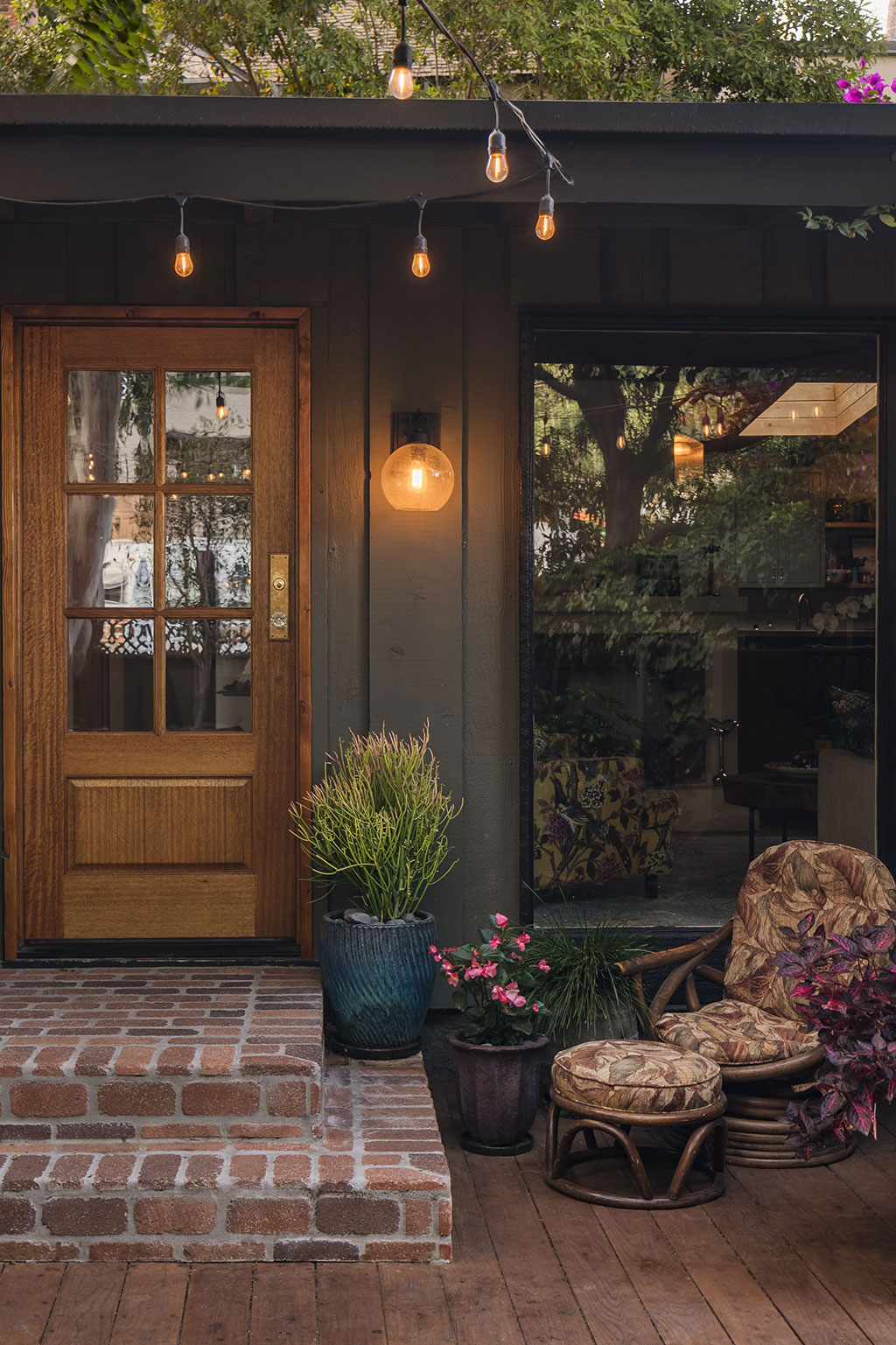
Because good lighting is incredibly important, we also added features, such as picture lights and flush-mount lamps, throughout the home that are incredibly modern and warm. At night, the lighting makes this one of my favorite projects I’ve ever done.
What structural changes did you make to the home?
We installed new brickwork and floor tiles in the kitchen and improved the layout, which was initially so cramped, all while keeping a vintage, homey look. It’s more of an entertaining-ready kitchen now.
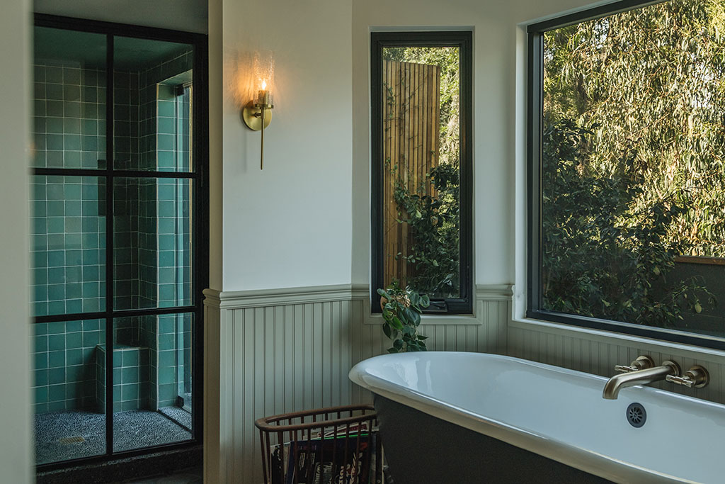
The main bathroom used to be incredibly dull—it had no door, little storage, and a weird layout that made poor use of space. I added a bay window, placed a bathtub there, and enclosed the doorway, all of which made room for a double vanity and created more privacy. This was the most major renovation.
How would you describe the resulting design?
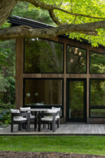
I describe this home as a midcentury tree house. There’s a lot of wood and warm color, so we embraced that and added even more wood—replacing vinyl windows and baseboards, for example. It’s welcoming, balanced, and inviting overall.
I try to ensure that my personal design style isn’t so cut-and-dried that people see a room and think, “Gian did that.” I don’t think it helps the homeowner when the designer is imbued into the project. My goal is ultimately to give someone what they really want but can’t put together themselves.
What design advice could anyone take from this project?
I’ve had clients whose homes just don’t represent who they are or how they want to present themselves. I view an interior as an expression of yourself. If your home isn’t you, then it doesn’t suit you and it won’t comfort you. Partners should come together to decide on what they enjoy so the resulting space feels balanced and responds to both of them. When I design for couples or families, I work to bridge a balance between each of the different residents.
I don’t think anyone should have things that are meaningless to them simply because other people have them. Everything in my home functions for me. If you want to surround yourself with Star Wars stuff, then go ahead! You just need a good design eye. I could make that look amazing.
For more info, visit gg-id.com


