Top 5 Painting Trends to Embrace This Year
Painting a room is one of the most impactful ways to lend it style, personality, and a calming vibe that you’ll love coming home to. The right shade can even pull together your decor and fixtures in surprising ways. If you’re considering making upgrades around your home, try making a low-cost investment and incorporating one of these paint trends in the months ahead.
Butter yellow
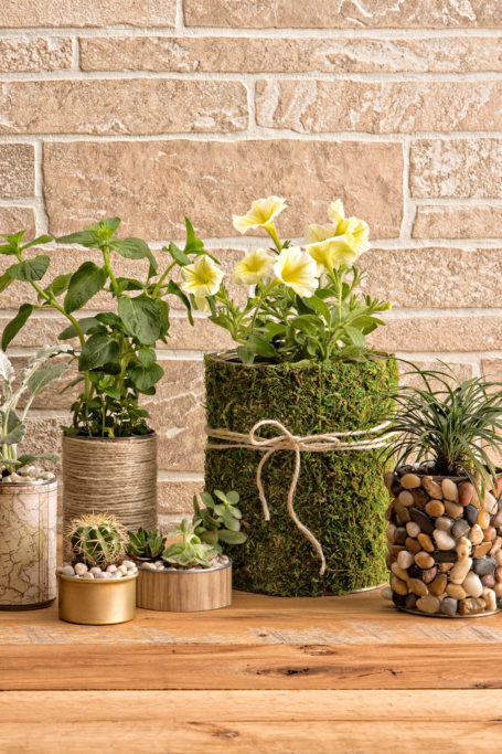
This color may seem strange, but out of the context of a toast topping, it’s actually a warm, comforting shade that’s surprisingly easy to decorate around, pairing nicely with natural wood, bright fabrics, and indoor plants. Painting a hosting space butter yellow can give it a unique touch that’s far more impactful than plain white or beige. And when used in the kitchen, this color could even help perk up your appetite.
Gradient effects
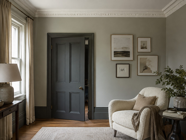
For bold sophistication and texture, try this trending effect, which involves painting one room with multiple shades of the same color across its ceiling, crown molding, walls, baseboards, and features like wainscoting. For example, you could paint a bedroom multiple types of blues: navy, cobalt, and powder. To experience the best results, try layering color vertically with the lightest shade at the top then darker ones on the bottom. This dynamic effect can help architectural details like wall paneling and arched ceilings stand out even more.
Chocolate brown
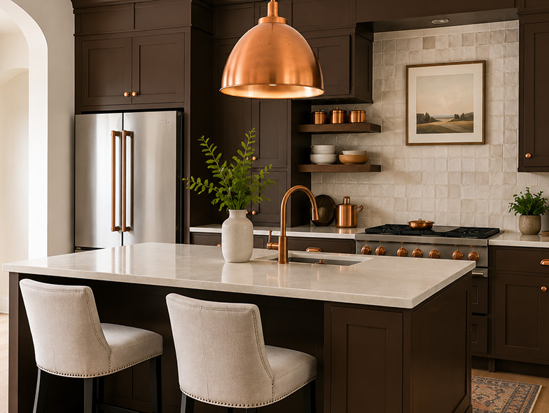
While this may be a surprising entry on this list, chocolate brown is actually back in style. It’s dark and heavy, yet it’s a statement-making tone when applied on accent walls, cabinetry, and smaller features like built-in shelving. It carries the same kind of natural effect as finished wood, and it’s eye-catching without being bright. For best results, use chocolate brown to pull together natural materials like pine, burlap, and copper, forming a backdrop to these lighter shades. If you’re worried about chocolate brown making a room feel smaller, pairing it with brighter, natural colors will balance it out, maintaining the appearance of ample space.
Limewash
More of a paint effect than a specific color, limewash involves applying a final layer to any paint. It gets its name from its natural components, including water and crushed limestone, and it can subtly transform the feel of a room. Rather than a flat finish, it gives subtle color variety, a layered look, and a natural feel that almost resembles terra-cotta texture. Because of its old-fashioned appearance, limit limewashing to a more sophisticated room, such as a reading nook or dining room; it may contrast with spaces that lean more modern, such as a bathroom or media room.
A color that will never go out of style, green combines the best effects of other hues: It’s calming and soothing like blue, naturally inspired like lavender, and bold like red. Try adding a touch of green to any space for an alluring look that’s low commitment. When painted in the kitchen, it’s especially effective. If you have a layout there that favors an accent color, such as one with an island or minimal upper cabinetry, paint those areas green to make them draw focus and add a vibrant touch to their surroundings. Opt for a darker shade like sage or forest green to be completely on trend—you’ll adore how it makes an ordinary room feel refreshed and refined.
357 Views
Related Posts




Popular Posts